React Native Accessibility: The 2026 WCAG 2.2 Guide
On April 24, 2026, the U.S. Department of Justice's final rule under Title II of the ADA takes full effect for state and local government mobile apps. The standard it points to is WCAG 2.1 Level AA — but regulators, courts, and procurement teams increasingly treat WCAG 2.2 AA (a W3C Recommendation since December 2024) as the real baseline. In Europe, EN 301 549 already requires it for public-sector apps, and private sector enforcement is picking up fast.
For React Native teams, this isn't abstract. Mobile app accessibility lawsuits more than doubled between 2022 and 2025, and WebAIM's 2026 report found detectable accessibility failures on 95.9% of the top one million home pages — numbers that strongly suggest native apps are no better. If your app ships to the App Store or Google Play, it is in scope for someone.
The good news: React Native maps nearly 1:1 to the native accessibility APIs on both platforms. Every accessibilityLabel prop you set becomes a UIAccessibilityLabel on iOS and an AccessibilityNodeInfo content description on Android. That's a huge head start — but you still have to use it correctly.
This guide walks through every WCAG 2.2 Level AA success criterion that applies to native mobile, maps each one to a specific React Native API, and shows you how to test them. By the end, you'll have a working checklist your team can run against any Expo or React Native CLI build.

React Native accessibility work is 70% knowing which prop to set and 30% knowing how to test it — Photo on Unsplash
The 2026 Accessibility Deadline Changes Everything
Three regulatory changes converged in the last 18 months, and together they shift mobile app accessibility from a "nice-to-have" to a hard legal requirement for a large class of apps.
The DOJ final rule, published in April 2024, is the first time U.S. federal regulation has explicitly named mobile apps alongside websites and tied them to a specific WCAG version. Governments and public entities with populations over 50,000 must comply by April 24, 2026; everyone else gets one more year. Procurement contracts for state agencies now routinely cite WCAG 2.1 AA as a pass/fail checkbox, which means any B2G app has to comply even if the DOJ rule doesn't technically apply to it.
Second, the European Accessibility Act (EAA) took effect in June 2025. It covers private-sector digital products — including banking, e-commerce, and transit apps — and references EN 301 549, which is harmonized with WCAG 2.2 AA. If you ship to EU users and you're above the small-business threshold, you're in scope.
Third, the plaintiffs' bar has caught up. In 2025, three Supreme Court cases (two in California, one in New York) affirmed that mobile apps are "places of public accommodation" under Title III of the ADA. Settlement amounts have climbed into the mid-six figures. Insurance carriers are starting to ask about accessibility testing before writing cyber-liability policies.
For a team building with React Native, the practical implication is simple: you need an accessibility audit as part of your pre-release checklist, you need to run it on every store build, and you need to be able to point at the compliance report when someone asks. The rest of this guide is how to actually do that.
What WCAG 2.2 Means for a React Native App
WCAG organizes 86 success criteria across three conformance levels (A, B, AAA) and four principles — Perceivable, Operable, Understandable, Robust (POUR). For mobile Level AA conformance, you need to pass all 55 Level A and AA criteria that apply to native apps.
Most WCAG criteria were written with the web in mind, but WCAG 2.2 explicitly added four criteria that affect native UIs:
2.4.11 Focus Not Obscured (Minimum) — the focused element must not be fully hidden by sticky headers, bottom sheets, or keyboard overlays
2.5.7 Dragging Movements — any drag gesture must have a non-drag alternative (think: reorderable lists)
2.5.8 Target Size (Minimum) — interactive targets must be at least 24×24 CSS pixels, with practical minimums of 44×44 on iOS and 48×48 on Android
3.3.8 Accessible Authentication (Minimum) — biometric or copy-paste alternatives for password fields
A handful of web-only criteria don't translate (parsing, headings in document outline, bypass blocks via skip links). The remainder map onto React Native's accessibility prop surface, which currently exposes:
<Pressable
  accessible={true}
  accessibilityLabel="Save changes"
  accessibilityHint="Double-tap to save your draft"
  accessibilityRole="button"
  accessibilityState={{ disabled: false, busy: isSaving }}
  accessibilityValue={{ min: 0, max: 100, now: 42 }}
  importantForAccessibility="yes"
  accessibilityLiveRegion="polite"
>
  <Text>Save</Text>
</Pressable>
That's the whole toolbox. The challenge isn't learning the API — it's knowing which prop corresponds to which WCAG criterion, and setting defaults so your team never ships a screen without them. On RapidNative, every generated screen comes out with accessibilityLabel and accessibilityRole already filled in, because the generation pipeline treats them as required props on interactive elements. Teams that write screens by hand usually have to retrofit the labels after a design review — which is where most compliance debt comes from.
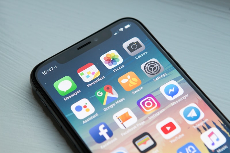
VoiceOver's rotor and TalkBack's local menu read exactly what you declare in your accessibility props — Photo on Unsplash
Perceivable + Operable: Mapping Success Criteria to React Native APIs
The first two WCAG principles cover roughly 60% of the audit surface and almost 100% of what users with disabilities actually notice. Here's the mapping that matters.
1.1.1 Non-text Content (A)
Every non-text element with meaning needs a text alternative. In React Native, that's accessibilityLabel on every Image, Icon, and non-text Pressable. Decorative images should set accessibilityElementsHidden={true} on iOS and importantForAccessibility="no-hide-descendants" on Android to keep them out of the focus order.
1.3.1 Info and Relationships (A)
Visual hierarchy must be exposed programmatically. Use accessibilityRole with values like header, button, link, image, search, and tab. For custom components, this is where most compliance work lives — a styled View with an onPress is invisible to screen readers unless you set the role explicitly.
1.4.3 Contrast (Minimum) (AA)
Body text needs a contrast ratio of 4.5:1 against its background; large text (18pt+ or 14pt+ bold) needs 3:1. The common failure in React Native apps is overlaying text on gradient hero sections — the ratio passes against the start color but fails against the end color. Audit with Contrast Ratio or Figma's accessibility plugin before you ship. Use semantic color tokens, not hardcoded hex values, so you can swap palettes without re-auditing every screen.
1.4.4 Resize Text (AA) + 1.4.10 Reflow (AA)
Text must scale up to 200% without clipping or horizontal scrolling. iOS Dynamic Type is on by default in React Native if you use fontScaling (which is enabled unless you explicitly disable it); the gotcha is that fixed-height Views will clip at larger sizes. Use minHeight instead of height for text containers, and avoid absolute-positioned labels inside fixed-size cards.
2.1.1 Keyboard (A) + 2.1.4 Character Key Shortcuts (A)
On mobile, this means hardware keyboard support (iPads, foldables, Android with Bluetooth keyboards). React Native's onKeyPress on TextInput covers the common case. For custom gestures, provide an alternative — which is the same requirement as 2.5.7 below.
2.4.3 Focus Order (A) + 2.4.11 Focus Not Obscured (AA)
Focus traversal must follow a logical sequence. React Native follows DOM order on iOS and view hierarchy order on Android — which usually matches visual order, but breaks when you absolutely-position elements or use zIndex. Use accessibilityViewIsModal on modals so screen readers trap focus inside them, and set accessibilityElementsHidden on background views when a modal opens.
For 2.4.11, when a keyboard appears and pushes a focused TextInput out of view, scroll to it with scrollToFocusedInput from react-native-keyboard-aware-scroll-view or Expo's KeyboardAvoidingView with behavior="padding".
2.5.5 Target Size (AAA) + 2.5.8 Target Size Minimum (AA)
The new 2.5.8 criterion requires 24×24 CSS pixels minimum; design systems should still target 44×44 on iOS and 48×48 on Android per each platform's HIG. The classic failure: icon-only buttons with 16pt icons and no padding. Fix with a hitSlop={{ top: 10, bottom: 10, left: 10, right: 10 }} on the Pressable, which extends the touch area without changing visual size.
2.5.7 Dragging Movements (AA)
If you ship a reorderable list (common in todo apps, playlists, dashboards), you must provide a non-drag alternative — typically a long-press menu with "Move up" / "Move down" options. Libraries like react-native-draggable-flatlist don't give you this for free; it's a UI pattern you implement yourself.
Understandable + Robust: Forms, Roles, and State
The second half of the audit is smaller but higher-leverage. These failures are the ones that get apps sued, because they prevent users from completing transactions.
3.3.1 Error Identification (A) + 3.3.3 Error Suggestion (AA)
When a form validation fails, the error must be programmatically associated with the input and announced to screen readers. In React Native, this means setting accessibilityLabel on the input to include the error state, or using AccessibilityInfo.announceForAccessibility('Email is required') after a failed submit. Don't rely on red borders alone — screen reader users won't see them.
3.3.2 Labels or Instructions (A)
Every input needs a visible label. Placeholder-only inputs fail this criterion because placeholders disappear on focus. Use a persistent <Text> label above the input, and wire them together with accessibilityLabelledBy on iOS (via nativeID).
3.3.8 Accessible Authentication (AA, new in 2.2)
Password fields must support autofill and allow copy-paste. React Native's TextInput with textContentType="password" and autoComplete="password" triggers iOS and Android password manager integration. Never disable paste on password fields "for security" — it fails WCAG 2.2 and encourages weaker passwords.
4.1.2 Name, Role, Value (A)
Every custom interactive component needs all three. A toggle switch, for example:
<Pressable
  onPress={() => setEnabled(!enabled)}
  accessibilityRole="switch"
  accessibilityLabel="Dark mode"
  accessibilityState={{ checked: enabled }}
>
  {/* visual toggle */}
</Pressable>
VoiceOver reads this as "Dark mode, switch, on" — which is what WCAG requires. Miss any of the three and the component fails 4.1.2.
4.1.3 Status Messages (AA)
Toast notifications, loading indicators, and "Saved" confirmations must be announced without stealing focus. Use accessibilityLiveRegion="polite" on Android and AccessibilityInfo.announceForAccessibility() on iOS.

WCAG 2.2 adds four criteria that specifically affect mobile touch interactions — Photo on Unsplash
Testing Your App for WCAG 2.2 Compliance
A compliance claim you can't demonstrate is worthless. Build this four-layer test workflow into your pre-release checklist.
Layer 1: Automated static analysis. Run eslint-plugin-react-native-a11y as part of CI. It catches missing accessibilityLabel on Pressable, invalid role values, and TextInput without accessible labels. It will not catch contrast or focus-order issues — no linter can.
Layer 2: Device-side screen reader walkthrough. Enable VoiceOver on iOS (Settings → Accessibility → VoiceOver) or TalkBack on Android (Settings → Accessibility → TalkBack) and navigate every primary user flow with your eyes closed. Takes 20 minutes per flow. This single step catches more real-world issues than any other technique.
Layer 3: Xcode Accessibility Inspector + Android Accessibility Scanner. The Inspector (Xcode → Open Developer Tool → Accessibility Inspector) runs an audit against a running iOS simulator and flags contrast failures, missing labels, and hit-target violations. Android's Accessibility Scanner does the equivalent on Android devices.
Layer 4: Appium + axe-mobile. For automated regression testing, Deque's axe DevTools Mobile plugs into Appium and runs WCAG 2.2 rulesets against built apps. Expensive, but it's the only way to prove compliance at CI speed on a large app.
The practical cadence: Layer 1 on every commit, Layer 2 on every PR touching UI, Layers 3-4 before every store submission. If you ship weekly, that's a 2-hour accessibility pass per release — small compared to the cost of a lawsuit, and smaller still compared to the cost of retrofitting labels into a mature codebase.
Common WCAG Failures in React Native (And How to Fix Them)
After auditing dozens of production React Native apps, five failure patterns show up over and over.
Pattern 1: Pressable without a label. A styled View wrapped in Pressable with icon-only content. Fix: add accessibilityLabel and accessibilityRole="button".
Pattern 2: Modal that doesn't trap focus. Users with screen readers can swipe past the modal and interact with background content. Fix: set accessibilityViewIsModal={true} on iOS and importantForAccessibility="no-hide-descendants" on the background on Android.
Pattern 3: Form errors that only show visually. Red border, no announcement. Fix: call AccessibilityInfo.announceForAccessibility() on validation failure.
Pattern 4: Custom switch/checkbox missing state. Looks right, reads as "button" to VoiceOver. Fix: accessibilityRole="switch" + accessibilityState={{ checked }}.
Pattern 5: Low contrast on gradient backgrounds. The hero text passes at the top but fails at the bottom. Fix: add a semi-opaque overlay behind the text, or move the text out of the gradient area entirely.
Teams building on AI mobile app builders usually dodge the first four because the generation templates include the right props by default. Contrast is harder to automate — it depends on your palette — but the design system discipline carries most of the weight. Teams writing React Native by hand have to catch these in code review, which means they usually ship a few before the first serious audit.
Shipping Accessible Apps From Day One
The hardest thing about WCAG compliance isn't the standard — it's the retrofit cost. An app with 40 screens that was built without accessibility props takes 2-4 weeks of focused work to bring up to Level AA. The same app, if built with the props from day one, takes zero extra time because the props are already there.
That's why the shift that matters is upstream: making accessible defaults the easier path than inaccessible ones. If your codegen, your component library, and your lint rules all require accessibilityLabel on every interactive component, you can't ship an inaccessible screen without actively trying to.
That's the bet RapidNative makes. Every screen generated from a prompt comes out with WCAG-ready props filled in — accessibilityRole, accessibilityLabel, accessibilityState, and target-size-safe hitSlop values — because the generation pipeline treats them as required, not optional. The semantic color tokens default to AA-contrast pairs. Form components ship with announcement hooks pre-wired. You can audit, you can tweak, you can override — but you start from compliant and work toward non-compliant, instead of the other way around.
If your team is staring at an April 2026 deadline, you have three choices: retrofit (slow and expensive), start fresh with manual discipline (works if your team is small and disciplined), or start fresh with a tool that bakes it in (works at any team size). The deadline doesn't care which you pick — just that you ship something compliant.
Start by running Layer 2 of the testing checklist on your current build. Twenty minutes with VoiceOver will tell you more about your React Native accessibility posture than any static analysis will.